MOCHA
Mocha was inspired by vintage inspired type. The old-fashioned style into the font, but still resembles the coffee bean in the the logo. The colors were based off of colors of Mocha.

STRAWBERRY
Strawberry Gelato is something that I wanted to experiment with what I could get away typography and playfulness. I wanted the word strawberry to seeds in the vector type with a nice sans-serif.

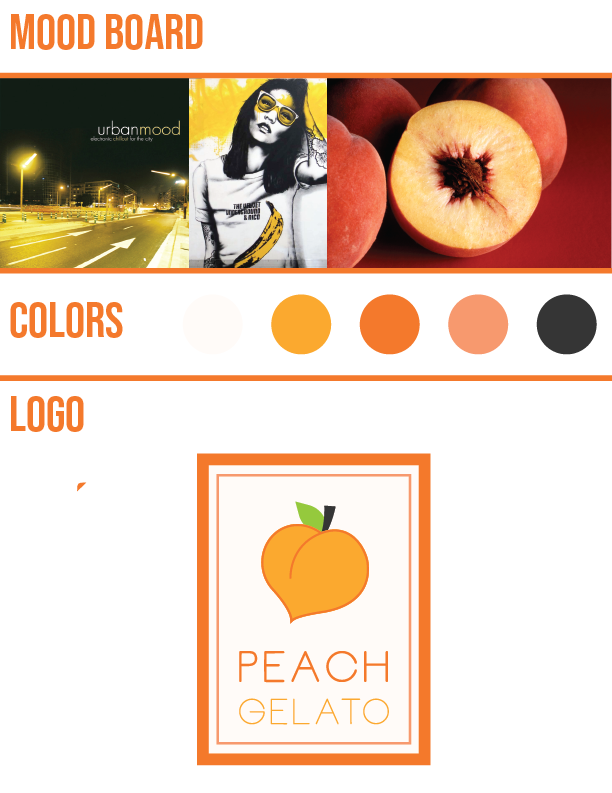
PEACH
This was inspire by urban culture. I wanted to take away home-grown of everything peach flavors and give it a new look. So a I gave a modern look to the font. I never tried using borders for a logo, so it's my first attempt at it.

CANNELLA
I wanted this to feel like this came from a cafe. Cannella is a popular flavor in Italy. It's cinnamon flavor gelato. So I wanted the trade mark to be like a top view of a cinnamon stick. I also was inspired by lattes and cinnamon rolls.

MENTA
Menta is Italian mint gelato. Mint is know to be fresh and clean. So I wanted my design to match the look of the feeling of eating mint gelato. I keep a lowercase to keep in simple and clean.

PUFFO
Puffo has a fun name, so I wanted the type to be as fun as the icon of the logo. Puffo is blue gelato that inspired by the blue smurfs. I wanted the personality to feel like it's fun as the smurfs. I used gradient to make it look sleek and to match the type treatment.

CHOCOLATE
When I thought of chocolate it always brings me back to sitting with my great grandfather. Whenever we went to visit him, my dad would give him a box of chocolate. So I was inspired to design from the boxes of chocolate we would give him. The pattern of the chocolate bar was inspired by the pants of my grandfather's pants.

LEMON
Lemon is summer fun. I wanted to take you back to day on the beach, from the colors and the way the type. Lemon makes such a refreshing desert so I wanted it to look clean. The bowl started at as the lemon, but I made it bowl.


